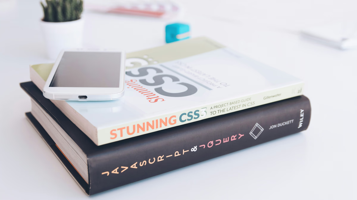
Modern CSS Techniques Every Developer Should Know
Discover powerful CSS techniques that can transform your web development workflow and create more responsive, maintainable designs
Modern CSS Techniques for Better Web Design
CSS has evolved significantly in recent years, introducing powerful features that make web design more efficient and maintainable. Let’s explore some modern CSS techniques that you can start using today.
CSS Grid and Flexbox
Modern layouts are built on these two powerful systems:
/* Grid Layout Example */
.grid-container {
  display: grid;
  grid-template-columns: repeat(auto-fit, minmax(250px, 1fr));
  gap: 1rem;
}

/* Flexbox Example */
.flex-container {
  display: flex;
  justify-content: space-between;
  align-items: center;
  flex-wrap: wrap;
}
CSS Custom Properties (Variables)
Variables make themes and dynamic styling easier:
:root {
  --primary-color: #3498db;
  --secondary-color: #2ecc71;
  --text-color: #333;
}

.button {
  background-color: var(--primary-color);
  color: white;
  transition: background-color 0.3s;
}

.button:hover {
  background-color: var(--secondary-color);
}
Modern Selectors
New selectors provide more precise targeting:
/* Select all elements except the first */
.item:not(:first-child) {
  margin-top: 1rem;
}

/* Select elements based on attributes */
[data-theme="dark"] {
  background: #1a1a1a;
  color: #ffffff;
}

/* Select based on parent state */
.parent:hover > .child {
  transform: scale(1.1);
}
CSS Animations and Transitions
Modern animations improve user experience:
.card {
  transition: transform 0.3s ease-in-out;
}

.card:hover {
  transform: translateY(-5px);
}

@keyframes fadeIn {
  from {
    opacity: 0;
    transform: translateY(20px);
  }
  to {
    opacity: 1;
    transform: translateY(0);
  }
}

.animate-fade-in {
  animation: fadeIn 0.5s ease-out forwards;
}
Container Queries
The future of responsive design:
@container (min-width: 400px) {
  .card {
    grid-template-columns: 2fr 1fr;
  }
}

.card-container {
  container-type: inline-size;
}
Best Practices
- Use Logical Properties
.element {
  margin-block: 1rem;
  padding-inline: 2rem;
}- Implement CSS Reset
*, *::before, *::after {
  box-sizing: border-box;
  margin: 0;
  padding: 0;
}- Mobile-First Approach
.container {
  width: 100%;
  padding: 1rem;
}

@media (min-width: 768px) {
  .container {
    max-width: 720px;
    padding: 2rem;
  }
}
Conclusion
Modern CSS provides powerful tools for creating beautiful, responsive designs. By leveraging these techniques, you can write more maintainable and efficient stylesheets while creating better user experiences.
Questions You Might Have
Can I create custom integrations with Core Systems?
Can I create custom integrations with Core Systems?
Discover how to create custom integrations with Core Systems using our extensive API and integration tools. Whether you need to connect with your existing systems or build custom workflows, we provide the flexibility and tools you need.
Read full answer How do I get started with Core Systems?
How do I get started with Core Systems?
Learn how to set up your Core Systems account, configure your first project, and start using our features. This guide walks you through the essential steps to get up and running quickly.
Read full answer What is Core Systems?
What is Core Systems?
Core Systems is a leading technology company specializing in AI-powered automation solutions, web development, and digital transformation services. We help businesses streamline their operations, improve efficiency, and leverage cutting-edge technology to stay competitive in today's rapidly evolving digital landscape.
Read full answerTable of Contents
Subscribe to our newsletter
Get the latest posts delivered right to your inbox